

UI/UX Design
Finally, we’ve arrived at probably the most exciting part of the design process, which is to design the user interface and user experience of the app. Personally, I’m not a trained UI/UX designer, so I will just do my best to design simple components and elements for basic interactions. The usual elements like windows, form elements and tables. I will also attempt to design some UX from the point of view of a user, which might not be conventional from the UX designer’s point of view.
In the previous exercise, I’ve mentioned that we have not yet decided on the UI framework to use for the app. However, it is still possible to design a UI that is applicable for use on a device, most likely it will be a laptop or desktop. For such devices, a GUI or CLI will both work. But since a CLI is just lines of text, we won’t go into the details of the CLI design, but instead focus on a GUI design.
Let’s get started!
Basic UI Components
There’re a few basic components, which are common throughout the app:
- Window: the outermost container that consists of smaller components.
- Form: the container within a window that consists of input elements.
- Table: the container within a window that displays data with CRUD actions.
Windows
For Windows, there are 2 possible layouts:
- Resizable window: this window can be resized as needed.
- Popup window: this window is an overlay on top of the resizable window, usually used in a case to display additional information on top of the content in the base window.
For the resizable window, there are 2 possible states:
- Logged out: this is when the user is logged out of the app, and there will be no side navigation.
- Logged in: this is when the user is logged in to the app, and there will be side navigation.
Blank window, logged-in window, popup window with and without buttons.
Forms
For forms, there are a few basic input elements.
- Text input: where the user enters text.
- Input label: this is the text next to the input to describe what is the purpose of the input.
- Input error: this is the text below or next to the input to describe what is the error of the input.
- Button: this is where the user can trigger an event, eg. confirm, view. There’re 2 variations: text-based and icon-based.
- Dropdown: this is the input where a list of options is available for the user to select.
- Datepicker: this is the input where the user can select a date. There’re 2 variations: single date and date range.
- Toggle button: this is the input where the user can toggle between 2 states, eg. active and not active.
- Tooltip: this is the text that is displayed when the user hover over an element.
- Hyperlink: this is the text that the user can click to trigger an event.
- Display text: normal text that is non-interactive. There’re 2 variations: normal weight and bold.
- Tag: this is the special text that is used to render the Tag data value.
Form elements, eg. text input, dropdown, datepicker, toggle button.
Filters
Filters are another variation of forms, except that they have a specific purpose of filtering data in a data table. Because they are a subset of forms, all form elements can be used in filters.
In this example, we have filters using date range element and dropdown element, with icon-based buttons for confirming or resetting the input.
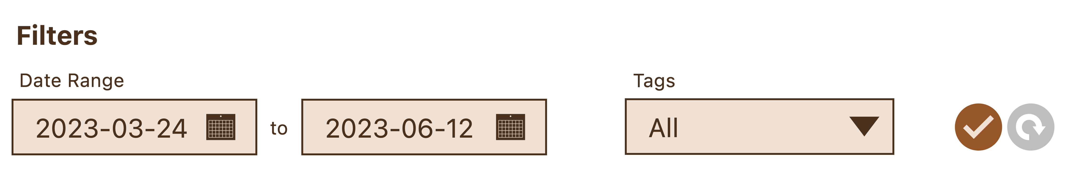
Filters control.
Tables
For tables, the purpose is to display data, and it is common to perform CRUD actions on the data, so we will have those actions available. At the table level, there is a Create action. At the row level, there are 3 actions: Read, Update and Delete.
Additionally, there is pagination available to each data table. Instead of using pages, we will use limit and offset for fetching paged data. The limit and offset values can be changed by the user in the filters.
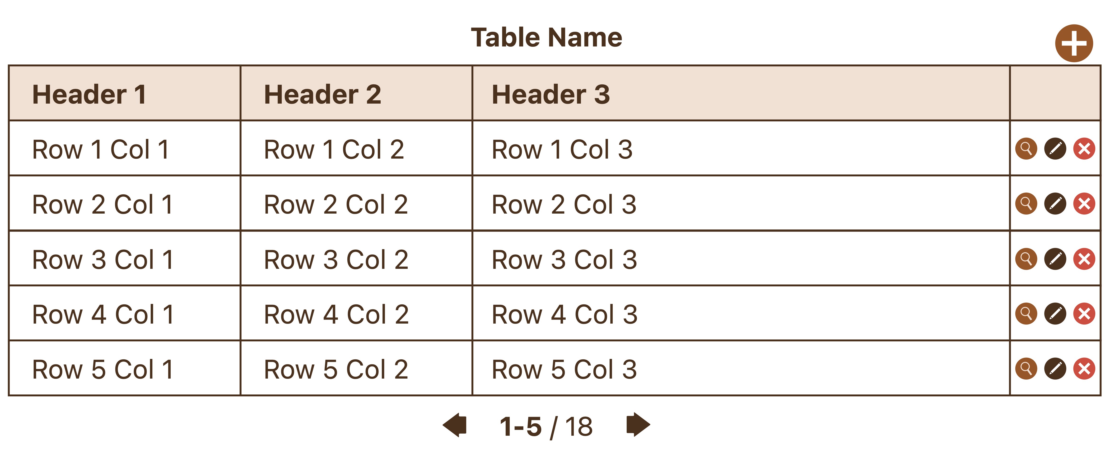
Data table with CRUD actions.
Basic UX
Now that we have the UI components decided, we can design some common UX using the components.
Login
The first interaction the user will have with the app is the Login screen. If she’s an existing user, then she can just input her username and password and login to the app.
If she’s new to the app, then she can use the New User action (which is rendered using a hyperlink element) to create an account. For simplicity, we will not draw out the New User UX, which is just a form filling flow that we have another example to illustrate later.
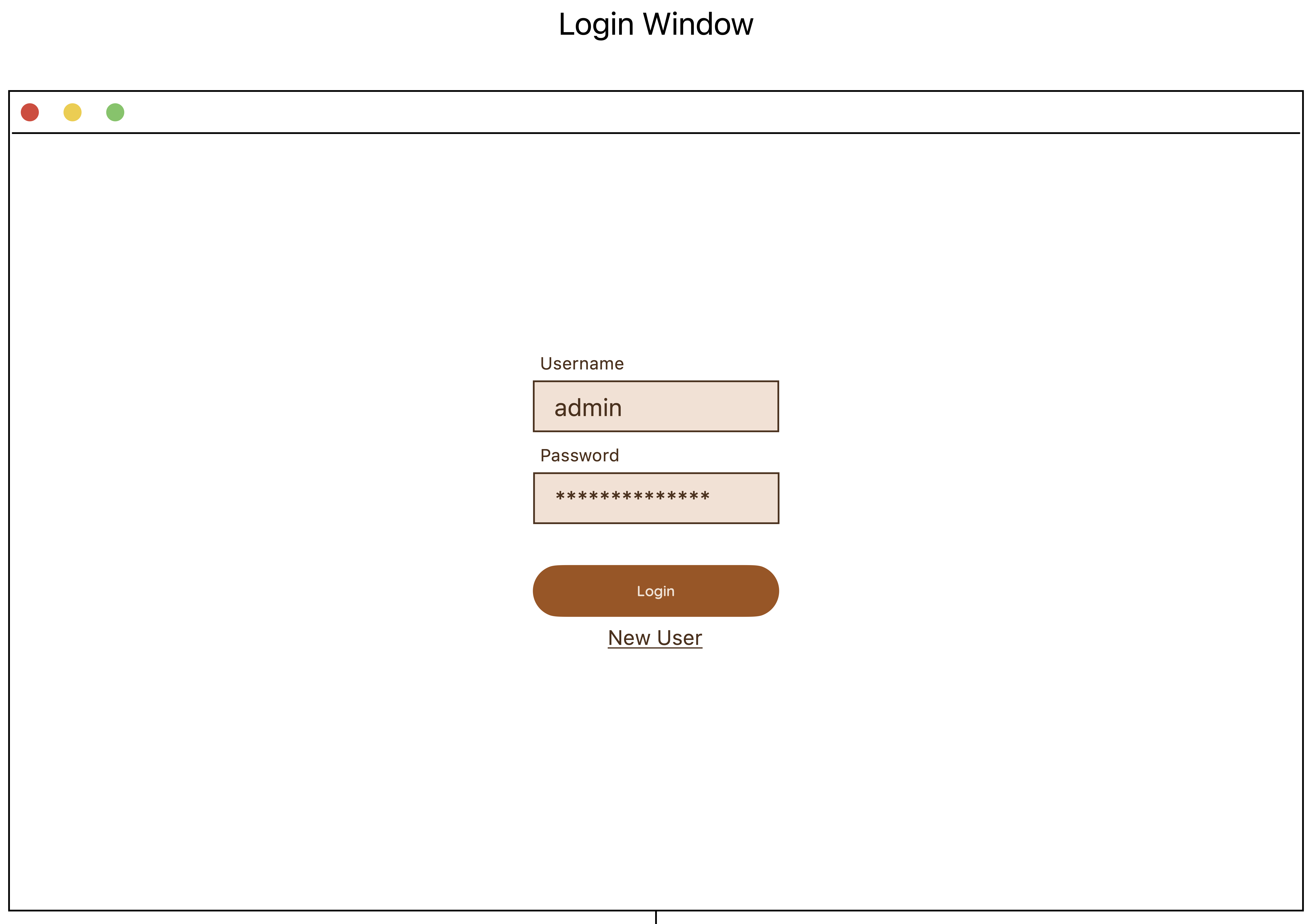
Login window.
Login Error
If the user enters the wrong credentials, then the screen will remain in the logged-out state. In addition, we will also display an error message to inform her of the failed attempt.
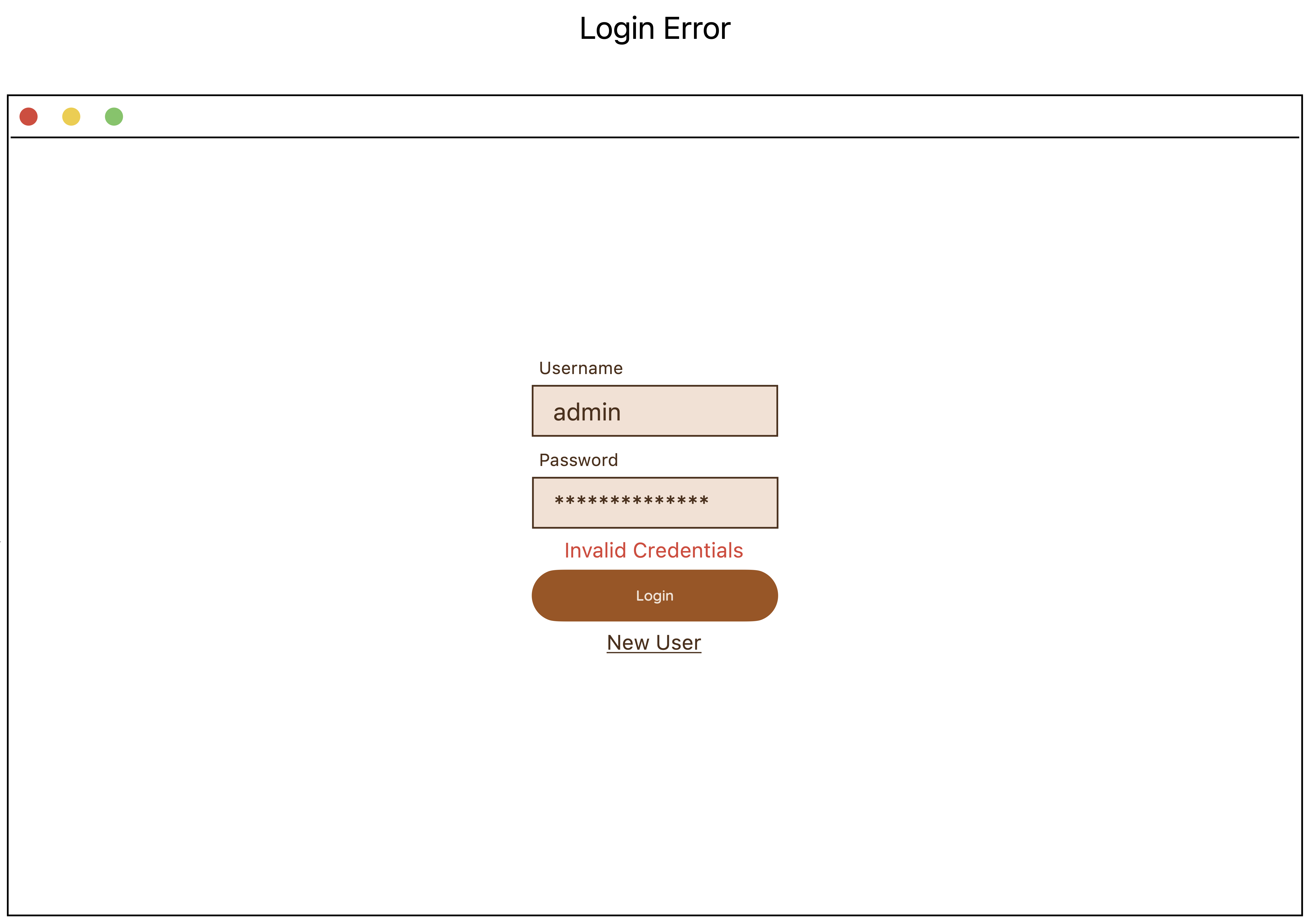
Login error - display error message.
Login Success
If the user has successfully logged in to the app, then she will see the Charts page as the home page.
There is a side navigation which has all the menu items to the various modules of the app, eg. Work Logs, Tags.
The active menu item is highlighted with a darker color to inform the user what page she is currently viewing.
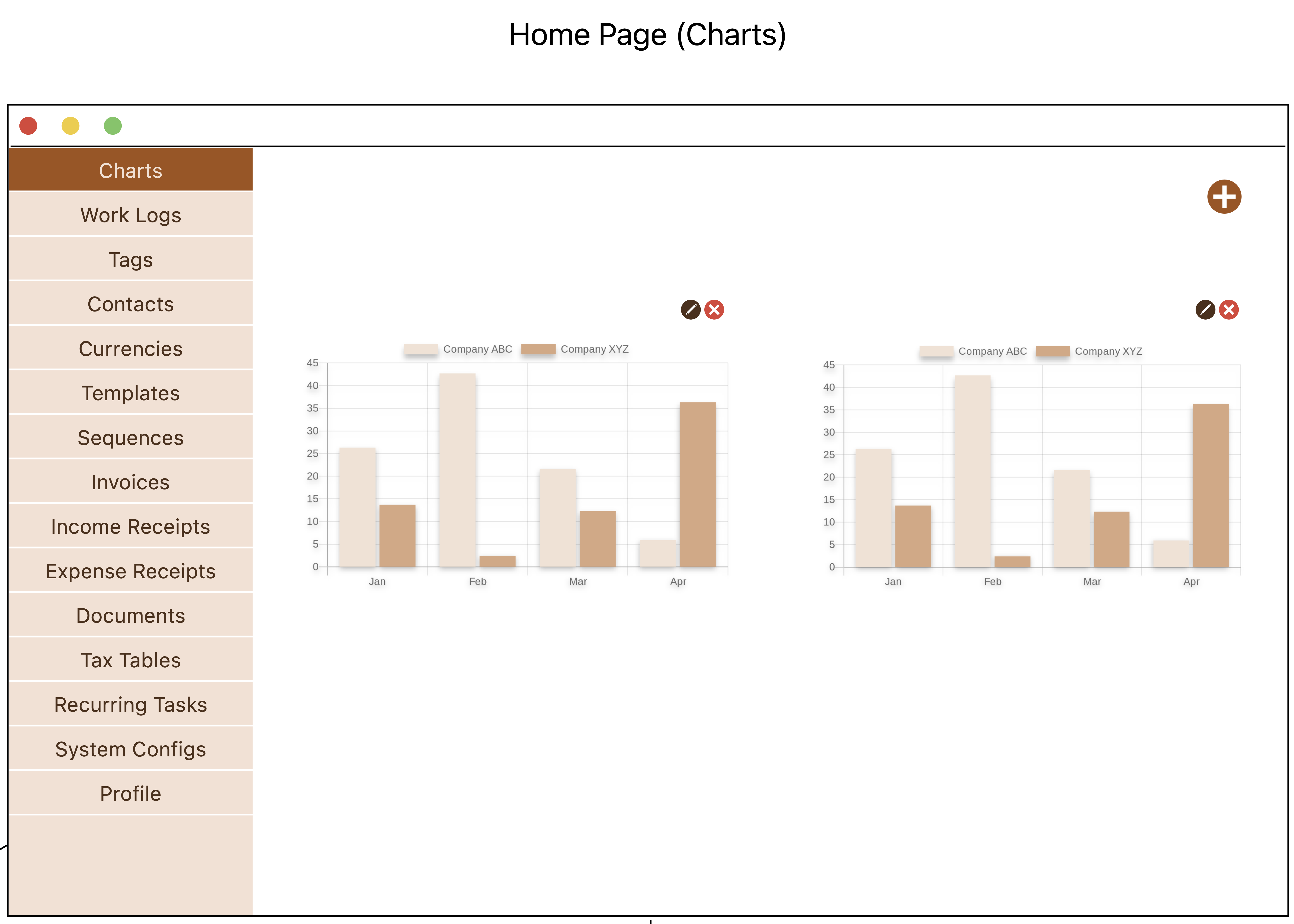
Login success - redirect to home page.
Create Form
Create is a common action in the app. Here, we can see an example of a Create Chart form.
Most forms, especially for Create and Edit actions, will be rendered in a window, but there may be instances where the form is simply rendered in a popup window. It will depend on the use case and the amount of input required from the user.
All forms will have action buttons, in most cases, there will be a Confirm button to submit the form, and a Cancel button to abort the form filling journey and redirect the user to the previous page.
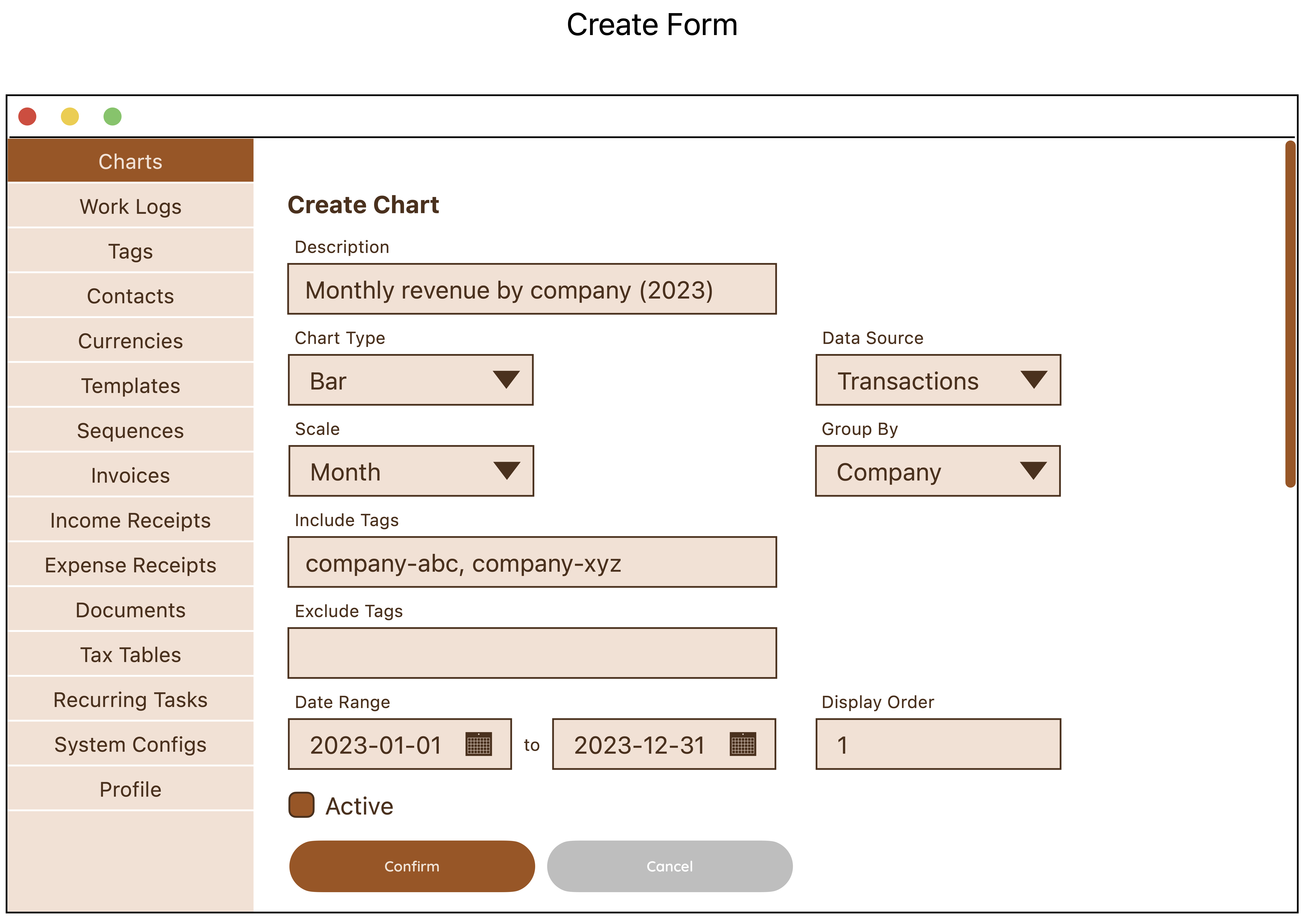
Create data form page.
Page Scrolling
In the event that the content of the page cannot fit into the viewport, then a scrollbar will be rendered to signal that there is more content available to the bottom of the page through scrolling.
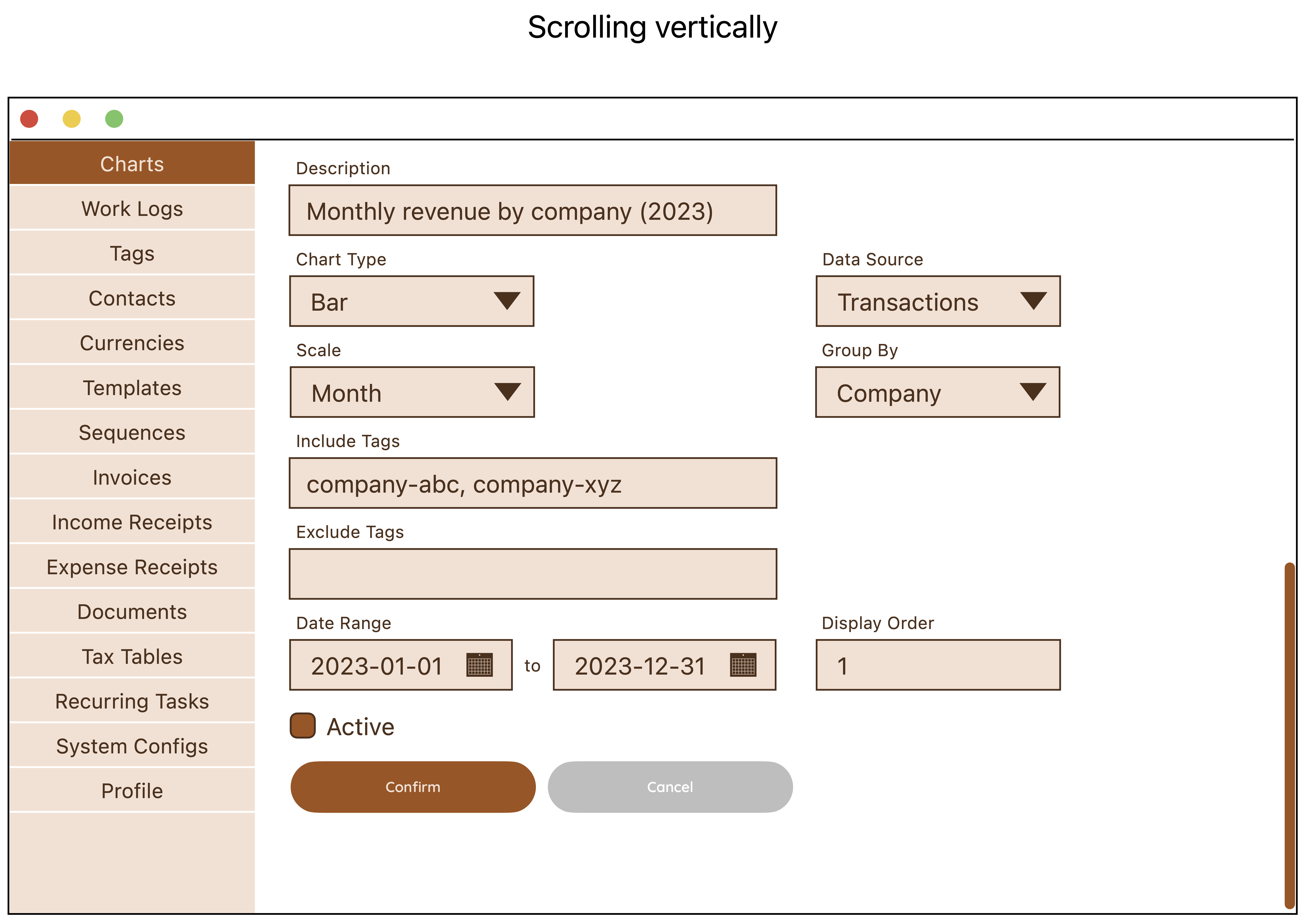
Vertical scrolling when page is longer than viewport.
Delete Form
Delete is also another common action in the app. Here is an example of a Delete Form.
In this case, there is no other input required except for confirmation, so we render it in a popup window, and provide only the Confirm and Cancel buttons.
There will be a title text on top that can be used to describe what is the action, then a primary text that is bold which can be used to ask for confirmation, and a secondary text in normal weight which can be used to display the description of the record to be deleted.
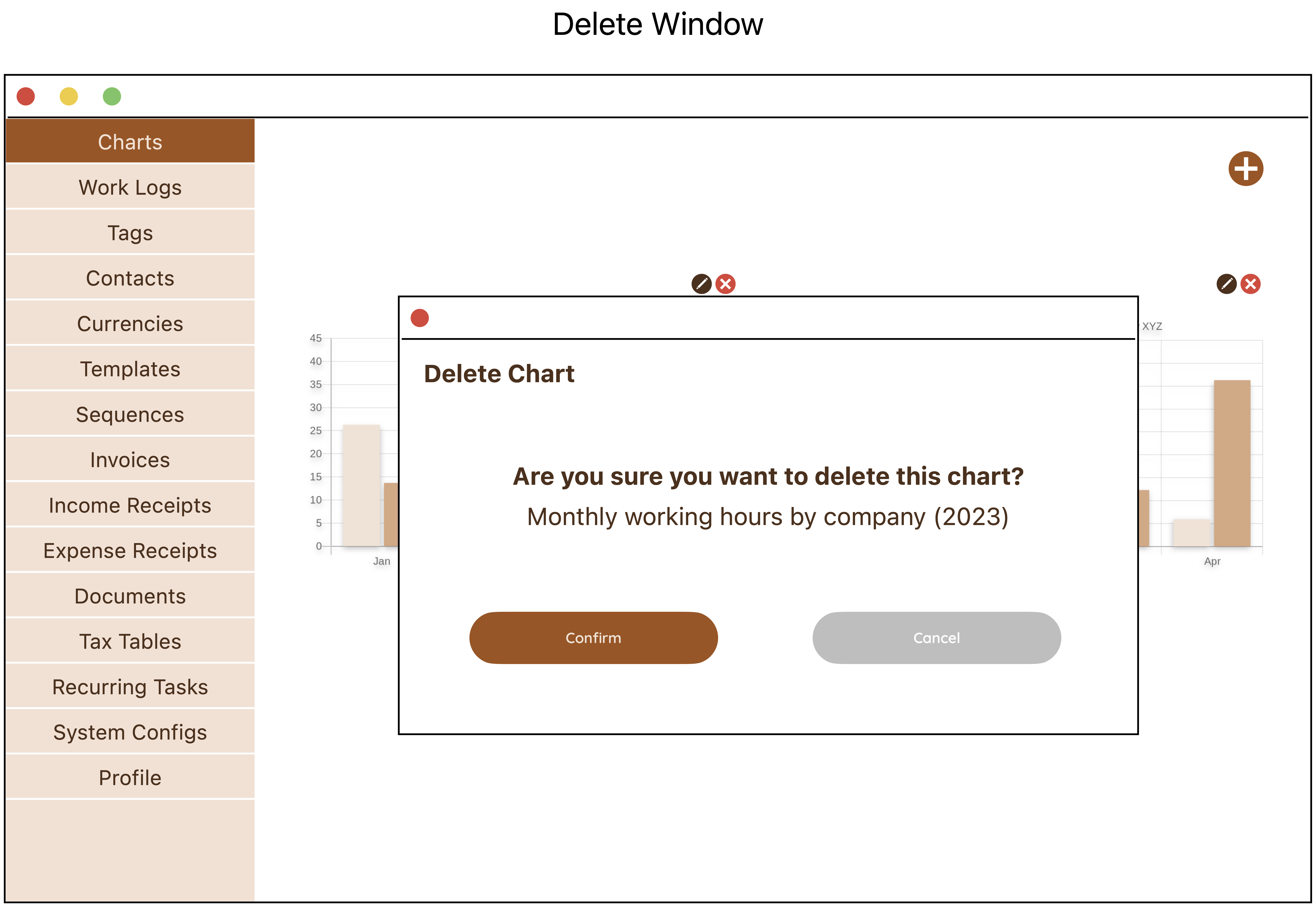
Delete data confirmation popup window.
Data Table with Filters
Data listing is essential in the app. Here, we have an example of a data table with filters control.
The filters can be used to select a limited set of data to be displayed. By default, there are some values that the system already use to select the data. If the user has changed the values, she can also use the Reset action to set the values back to default.
This is a typical data table with all CRUD actions available. In addition, at the row level, there is a special action for End Work Log, which replaces the Update action, when the Work Log has no end time yet.
Additional page-level buttons can also be added, eg. there is a Generate Invoice button that allows the user generate invoice right from the Work Logs page.
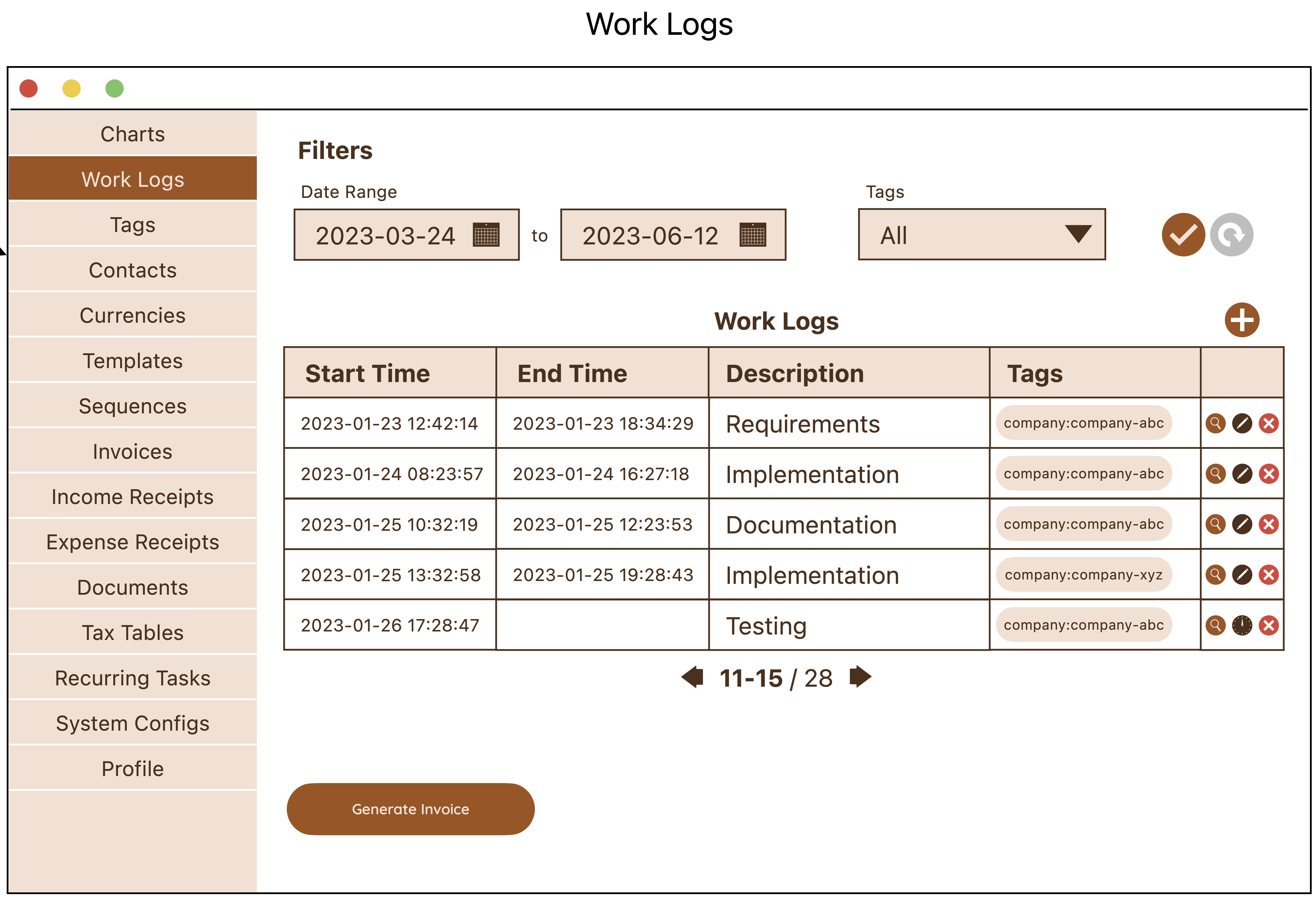
Data table with filters control.
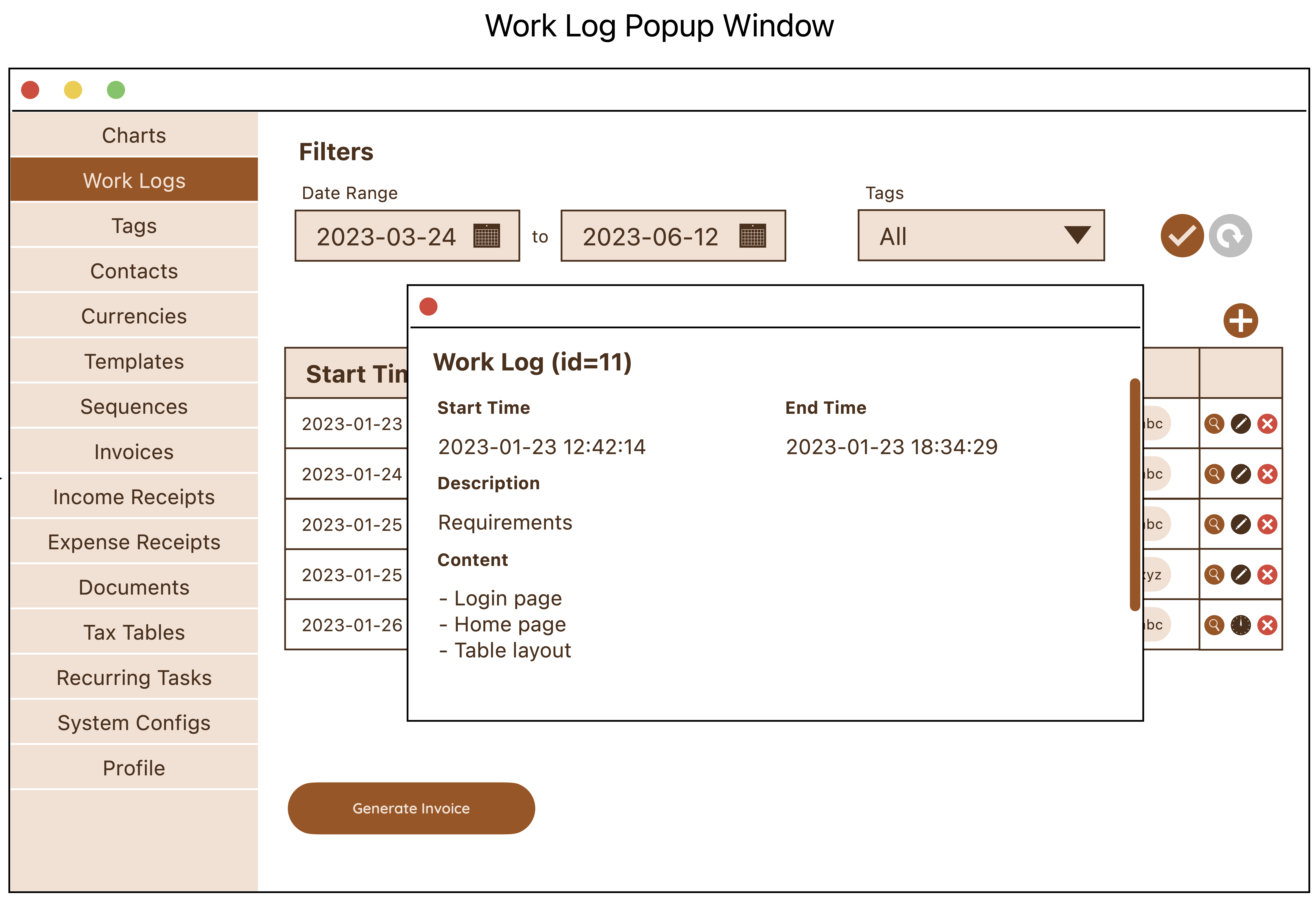
View Popup Window
Viewing the details of a data row can be done via 2 ways: in a window, or in a popup window.
Here, we demonstrate what it looks like to render a data row in a popup window.
The popup window uses a 2-column layout to render the fields of the Work Log, with some fields spanning 2 columns due to having potentially longer text to display.
View data popup window.
Similar to a window, a popup window also supports vertical scrolling if the content cannot fit into the popup window size.
In addition to data display, we also provide some action buttons for the convenience of the user to Edit or Delete the record, so that she doesn’t have to close the window in order to perform these actions.
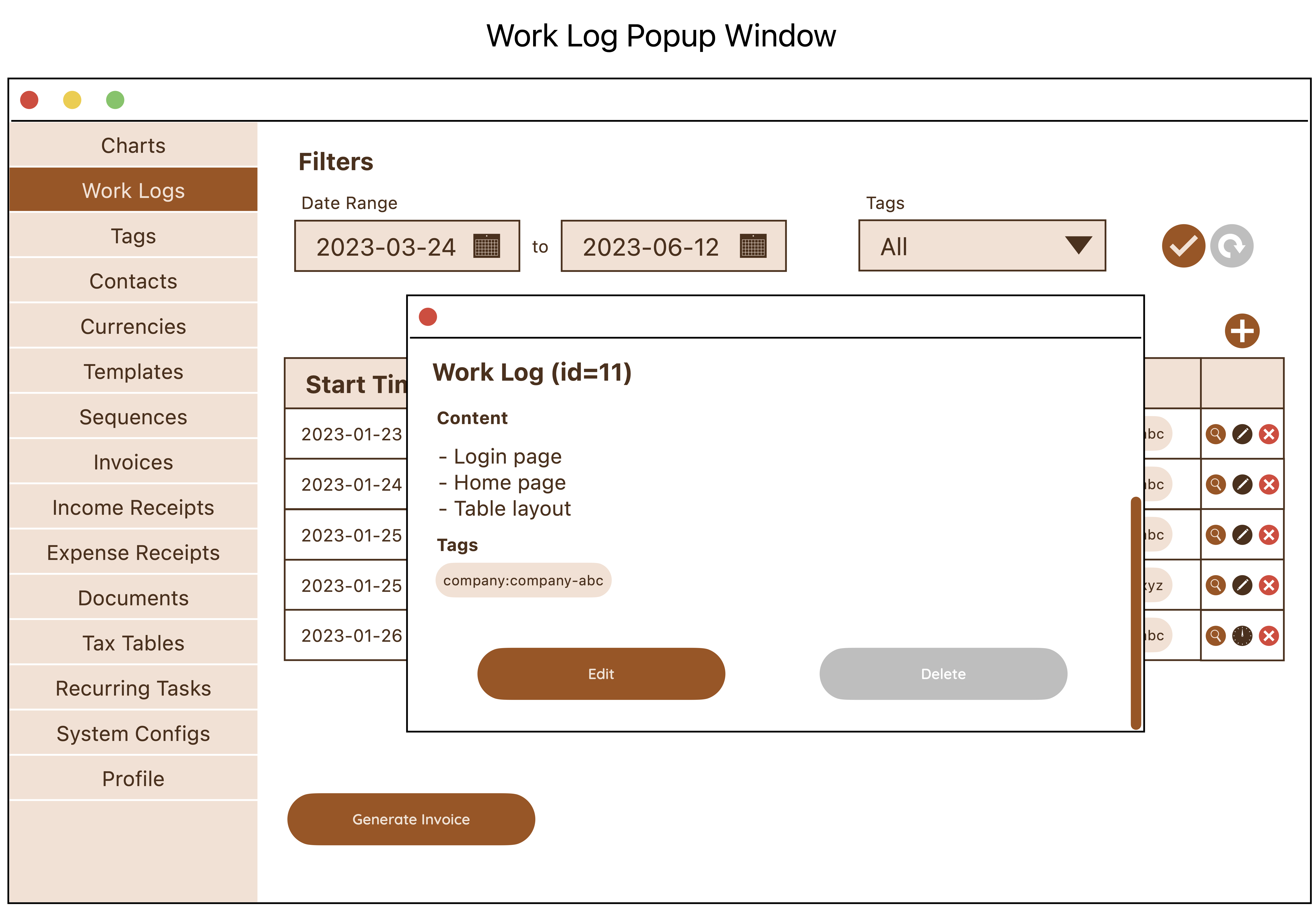
Popup window with vertical scrolling.
This Is It
Here’s an overview of all the components we have designed for now. This overview diagram also illustrates some page transition flow when the state of the app changes.
UI/UX design is definitely not my strength, but it is still a very critical part of the design process, which is why I still required myself to do the exercise. The same can be said for the previous design exercises we have gone through earlier. If you’re a trained frontend engineer, you might find drawing sequence diagrams and designing system architecture a little challenging, but these are also equally important part of the design process, and it is beneficial to go through them regardless. As we practise these exercises more with each app we build, we will surely learn a few tricks and get better the next time.
With that, we can conclude the design phase of the app. It’s time to get into the lower-level details of the app, which is to actually build it with code!
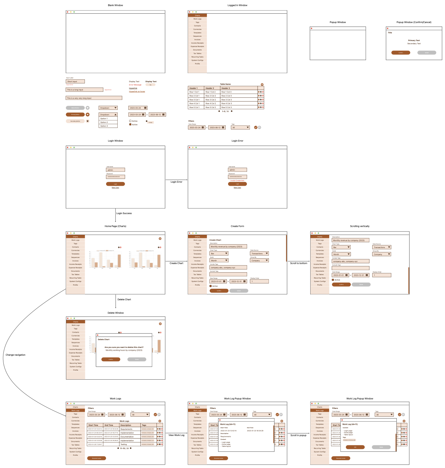
The overall UI/UX of the app. (View full size)